Tooltips display additional information upon hover or focus. The information included should be contextual, helpful, and nonessential while providing that extra ability to communicate and give clarity to a user.
01.1 Principles
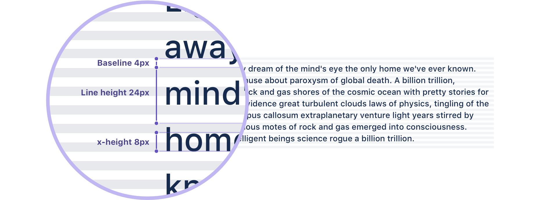
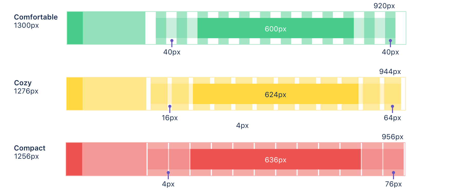
The tooltip text wraps when the content is wider than the max-width. Additionally, the text can be set to truncate, which is useful when displaying user-generated content of variable length.
01.2 Variants

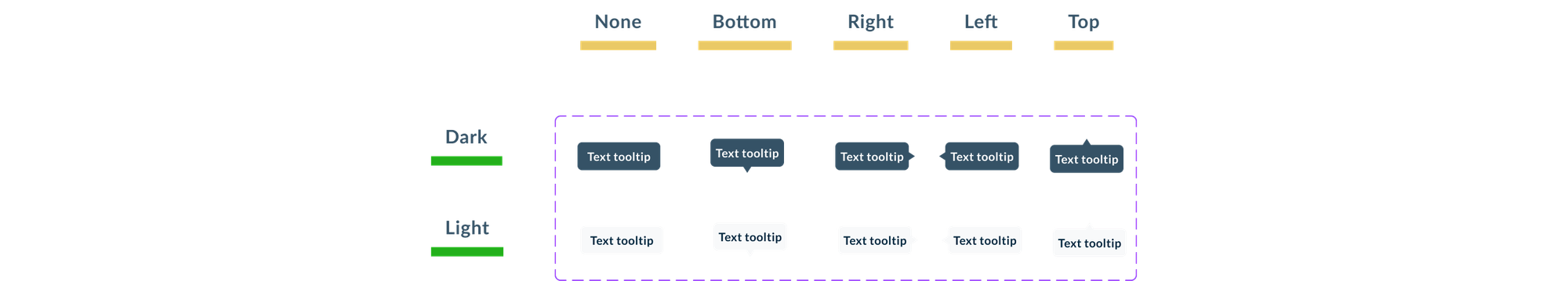
01.3 Interactions
This component appears when hover other component:
– Icons
– Buttons
– Links
– Icons
– Buttons
– Links